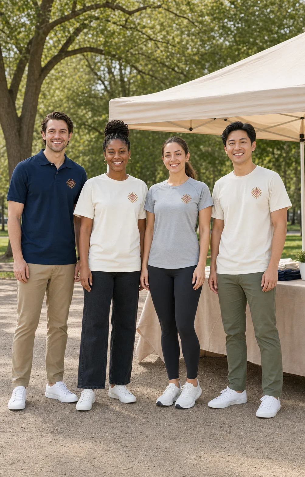
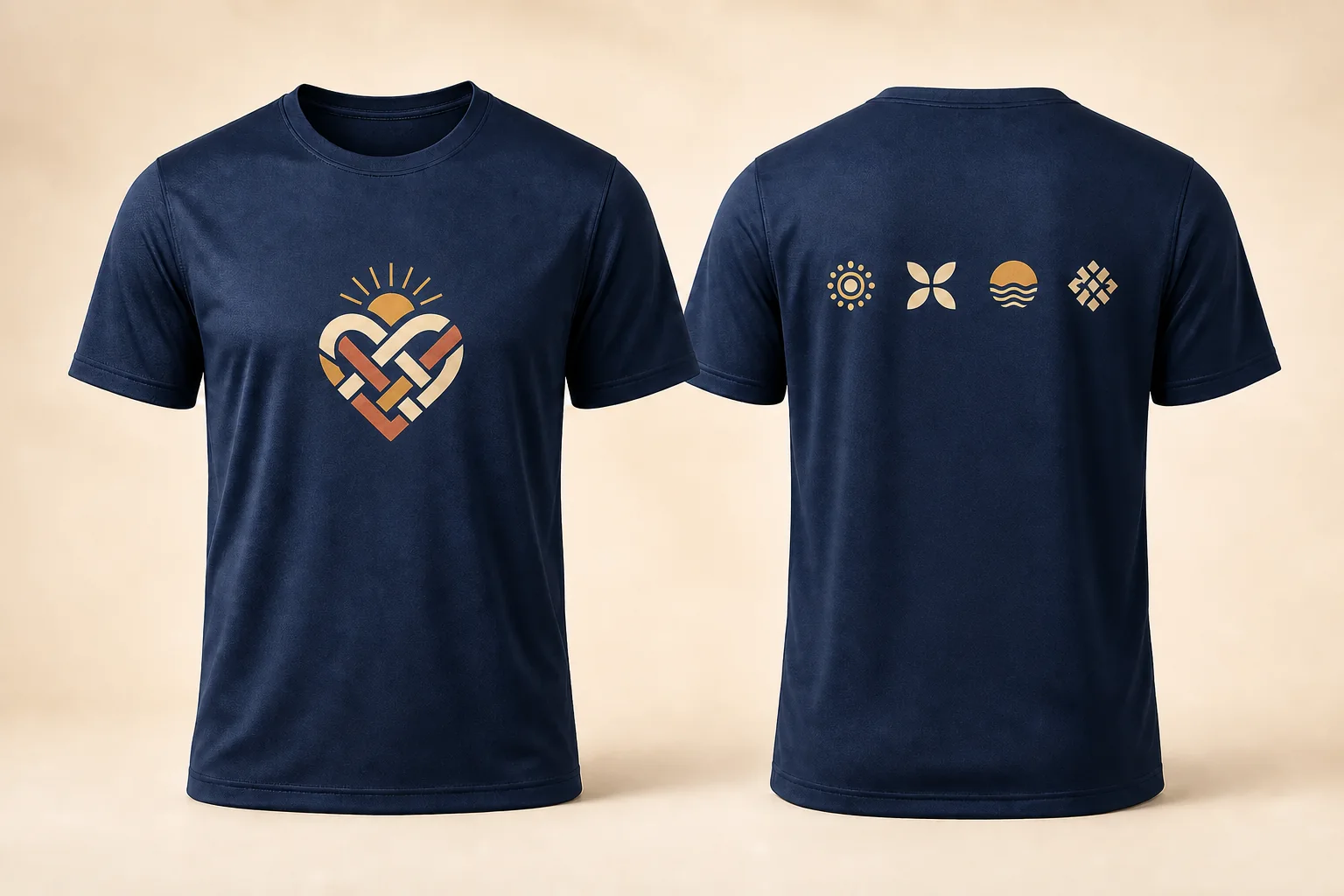
Short answer: Put the cause or event identity on the front. Put sponsor marks, one optional team name, and a tested donation link on the back. Keep one clear hierarchy instead of trying to make every item equally large.
The shirt has to work in motion, in group photos, and months after the event. A simple front helps people recognize the cause; an organized back gives sponsors visibility without turning the whole shirt into a flyer.
Start with one visual hierarchy
Before anyone opens a design file, decide which message should be noticed first, second, and third:
- Cause or event identity — the reason people are together
- Event details — usually the name, year, and perhaps the city
- Supporting information — sponsors, team name, donation link, or a short URL
If two elements compete for first place, the design will usually feel crowded. Pick one lead mark and let the other information support it.
What belongs on the front
Use the front for recognition, not administration. A reliable front layout contains:
- one cause or event emblem;
- the event name and year;
- no more than one short supporting line; and
- enough open space for the design to read from several feet away.
A centered chest print gives an event the strongest shared identity. A left-chest mark feels more like staff or volunteer apparel. Avoid putting the full sponsor list on the front unless a lead sponsor is contractually required there.
For practical starting widths and the smallest-shirt review, use the T-shirt logo size and placement guide before approving the front and back together.
How to organize the back
The back can hold more information, but it still needs order.
| What you have | Strong starting layout |
|---|---|
| No sponsors | Event date, location, or a small organizing-group mark |
| 1–4 sponsors | One compact row across the upper back |
| 5–9 sponsors | A balanced two- or three-column grid |
| 10+ sponsors | Lead tier first, supporting tier second, one-color fallbacks where needed |
Normalize sponsor marks by visual height, not by giving every logo the same rectangle. A wide wordmark and a round emblem need different boxes to appear equally important.
Ask for vector files when possible. If a sponsor sends only a PNG, request the largest transparent version available. Do not rebuild or recolor a sponsor mark without approval.
Add a QR code only when it earns the space
A QR code is useful when the shirt may keep raising money after the event. Place it away from seams and fabric folds, add a short typed destination beside it, and test the approved print-size proof on at least two phones.
Do not rely on the QR code as the only explanation. Someone looking at a photo still needs to understand what the event supports.
Be selective with names
A single team or crew name is easy to place above the sponsor area. A full participant list works only when the roster is small, final, and carefully proofread. For a large or changing registration list, skip individual names rather than shrinking them until they are unreadable.
Match the shirt to the event
“Polyester” alone does not guarantee a comfortable race shirt. Ask for the fabric construction, weight, stretch, hand feel, and moisture-management finish.
| Event format | Useful starting garment | Why |
|---|---|---|
| Timed 5K or active run | Lightweight technical performance tee | Faster drying and less water retention during exertion |
| Casual community walk | Soft cotton-poly blend | Comfortable during the event and easy to re-wear casually |
| Volunteer or setup crew | Midweight cotton or blend tee | Familiar feel, good coverage, and broad decoration compatibility |
| Cool-weather event | Performance tee plus an optional hoodie layer | Keeps the event identity consistent across roles and weather |
For a mixed event, runners and volunteers do not have to wear the same garment. They can share one design system across a performance tee and a cotton or blend option. Use the charity 5K garment guide to choose by activity and the volunteer-shirt guide to keep role labels clear.
Choose color for contrast and continuity
Use your organization’s established palette first. If the cause has a widely recognized color, confirm that your chapter or partner organization uses it before building the shirt around it.
Then test the actual combination:
- Does the lead mark separate clearly from the shirt color?
- Can small sponsor marks survive in one color if needed?
- Will the QR code retain a quiet light area around it?
- Does the design still read in a group photo from several feet away?
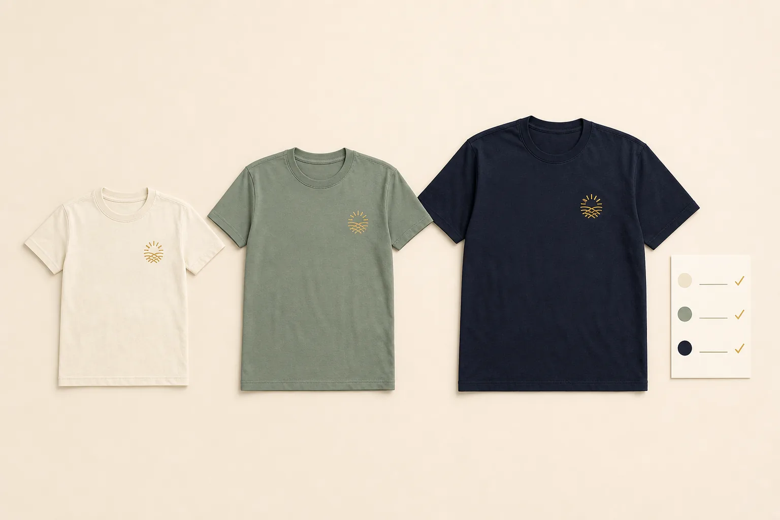
The shirt color is the largest color field in the design. A restrained navy, cream, charcoal, or cause-led color usually gives the artwork and sponsor grid more room to work.
A practical approval sequence
- Freeze the event name, year, and cause line.
- Collect sponsor files and confirm their promised tier or placement.
- Decide whether the garment is for runners, walkers, volunteers, or a mix.
- Build the front and back together so one side does not become an afterthought.
- Review the mockup at realistic print size, not only enlarged on a screen.
- Test the QR code and proofread every date, URL, sponsor name, and participant name.
- Get one named approver to sign off before production.
Start about 5–6 weeks before the event. That leaves room for sponsor collection, one or two proof rounds, size collection, production, delivery, and sorting.
Final shirt checklist
- Event name and year are correct
- One cause message clearly leads the front
- Sponsor order matches the agreed tiers
- Every logo file is approved and legible
- QR code works at the proposed print size
- Names, dates, city, and URL are proofread
- Shirt fabric matches the actual activity
- Youth and adult sizes are included where needed
- One person has authority to approve the final mockup
How Togethread helps
Togethread plans fundraiser orders from 50 pieces. Send a clear cause direction, sponsor files, event date, and rough size count; a designer reviews them and confirms the free first-mockup timing in writing. Nothing prints until you approve the design, and you review photos of the finished batch before the balance is due. Before opening orders, compare the paid-preorder process and fundraiser price formula.
See bulk fundraiser shirt options →
FAQ
Should every sponsor logo be the same size? Not necessarily. Sponsors in the same tier should have similar visual prominence, but a wide wordmark and a compact emblem need different dimensions to look balanced.
Where should a donation QR code go? The lower or mid-back can work if the area stays flat and clear of seams. Keep a quiet border around the code, add a short typed destination, and test the approved print-size proof before production.
Can runners and volunteers use different shirts? Yes. Keep the same cause identity and palette while using a performance shirt for runners and a cotton or blend shirt for volunteers.
When should sponsor files and participant names be final? Before the first full proof whenever possible. Dense sponsor grids or individual name lists often need an additional review round, so do not leave them until production week.