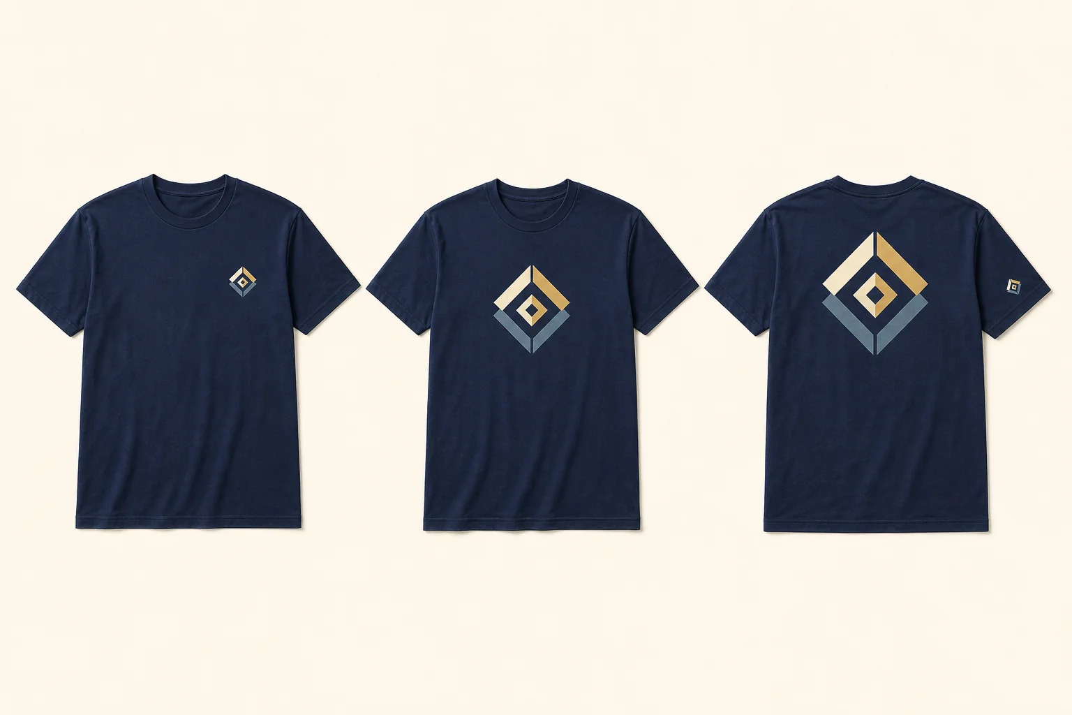
Short answer: For a standard adult T-shirt, a 3–4 inch-wide left-chest mark, 6–10 inch center-chest design, or 10–12 inch full-front or full-back design is a useful first mockup range. These are not production specifications. The exact garment, smallest and largest sizes, printable area, artwork shape, and decoration method decide the final dimensions.
The safest workflow is simple: choose the location by purpose, give the designer an intended width, and approve a mockup tied to the actual garment. Do not approve a floating logo on a blank canvas with no shirt size or print-area reference.
Quick placement chart
| Placement | Useful adult starting range | Best for | Check before approval |
|---|---|---|---|
| Left chest | 3–4 in wide | Company marks, clubs, staff polos, small icons | Fine text, pocket or placket, embroidery area, smallest garment |
| Center chest | 6–10 in wide | Compact event art, short text, school or team mark | Collar distance, artwork height, readability in photos |
| Full front | 10–12 in wide | Main event graphic, class design, fundraiser art | Provider print area, fabric coverage, youth and small sizes |
| Upper back | Use the actual template | Staff role, short wordmark, small secondary mark | Collar and hood overlap, shoulder seam, hair coverage |
| Full back | 10–12 in wide | Sponsors, team identity, large information hierarchy | Smallest shirt, longest text line, sponsor legibility |
| Sleeve | Use the actual template | Sponsor, year, department, small secondary icon | Sleeve length, seam clearance, method availability |
These are planning ranges for conventional adult shirts, not universal standards. VistaPrint’s current placement guide uses 3–4 inches for a left-chest mark and 10–12 inches for common adult full-front or full-back designs. Printful’s placement guide publishes broader system-specific ranges and repeatedly notes that exact positioning changes with the product and size. Printify likewise tells users to check the selected provider’s placement chart because print areas vary by shirt and supplier.
Choose the location by what the shirt must communicate
Left chest: quiet identification
A left-chest logo works when the garment should feel like staff, uniform, club, or company apparel. It is intentionally restrained. Use a simplified version of a detailed crest, avoid tiny taglines, and confirm whether the mark will be printed or embroidered before finalizing the size.
Do not position it by eye on one large mockup and assume the same coordinates fit every shirt. A pocket, placket, V-neck, smaller body, or short sleeve can change the usable area.
Center chest: visible without filling the shirt
Center chest suits a compact logo, short phrase, or event identity that needs more visibility than a pocket-size mark. Align from the actual collar midpoint, not from the edge of a screenshot. A useful starting position is roughly 2–3 inches below a conventional crewneck collar, then adjusted to the design height and garment.
Full front: the main graphic
Use a full-front placement when the design is the reason for the shirt: a class emblem, fundraiser identity, reunion graphic, or bold team mark. Larger artwork needs enough real pixels or vector artwork; the logo file checker explains how print width changes effective resolution.
The maximum printable rectangle is not automatically the best-looking size. Leave enough open garment around the artwork so it does not crowd the collar, seams, or hem.
Back: hierarchy before size
The back can carry a large team name, sponsor group, volunteer role, or secondary event message. Decide what should read first, second, and third before choosing dimensions. A twelve-inch sponsor block can still fail if every mark is equally loud or the smallest names are unreadable.
For sponsor layouts, normalize similar tiers by visual prominence rather than forcing every logo into the same box. Test the longest wordmark and smallest sponsor mark at the intended print size.
Sleeve: use only when it adds information
A sleeve mark is useful for a sponsor, department, event year, or compact secondary icon. It is not a free extra location: sleeve length, seam clearance, available platen or hoop, artwork detail, and price can all change. Ask whether the exact garment and method support it before building the whole design around that location.
The smallest shirt is the first production test
An adult large mockup can hide problems. Review at least the smallest and largest garments in the real order, especially when the size list includes youth and adult products.
Check five things:
- Printable area: Does the proposed artwork fit the supplier’s template for the smallest garment?
- Proportion: Does one fixed print size overwhelm a youth shirt or disappear on an extended size?
- Seams and construction: Is the mark clear of collars, plackets, pockets, side seams, sleeve seams, and hoodie pockets?
- Readability: Can the smallest text and narrowest gap survive at actual size?
- Consistency: If the artwork must be scaled across size groups, has the supplier documented which sizes use each version?
There is no rule that every garment size must receive a different print size. One shared size is often operationally simpler, but it must work on the smallest printable area. When it does not, agree on a small number of documented size groups rather than making ad hoc changes during production.
T-shirts, polos, hoodies, and performance shirts are not the same canvas
- T-shirts: Collar shape, body width, and youth sizes affect how a centered print sits. Compare the supported garment routes before treating one placement as interchangeable across every shirt.
- Polos: The placket, buttons, pocket, and textured knit make compact left-chest work the usual starting point; compare embroidery and printing for the actual logo, then use the bulk polo cost guide to quote the same garment, logo size, location, quantity, and delivery scope.
- Hoodies and crewnecks: Hoods, drawcords, kangaroo pockets, zippers, and thicker fleece can reduce or interrupt the front area. A back design also needs to be reviewed with the hood resting naturally.
- Performance shirts: Stretch, mesh zones, seams, dye migration risk, and sublimation panels can change both the placement and decoration route.
Always name the exact garment before approving dimensions. “Four-inch left chest” is not a complete production instruction by itself. Approve the artwork again when the garment color changes; the shirt and print color guide explains how to keep contrast and logo recognition consistent without adding unrelated design elements.
A clean placement brief to send the designer
Copy this structure into the quote or artwork notes:
Garment: [exact style and color]
Size range: [smallest through largest]
Primary location: [left chest / center chest / full front / back]
Intended artwork width: [inches]
Secondary location: [none or exact location]
Decoration direction: [print / embroidery / designer to recommend]
Must remain readable: [name, date, sponsor, small text]
Approval request: show the smallest and largest garment sizes
This is more useful than asking for a logo to be “medium” or “a little higher.” It gives the designer a measurable starting point while leaving room to correct the layout for the actual blank.
Final approval checklist
- Exact garment style, color, and size range are named
- Finished width and height are written for every location
- Smallest and largest garments have been reviewed
- Collar, placket, pocket, hood, zipper, and seams are accounted for
- Small text and fine detail are readable at real print size
- Front, back, and sleeve locations are listed separately in the quote
- Logo color version matches every garment color
- Mockup is approved by one named decision-maker
- Any size-group scaling is documented before production
FAQ
What is the standard left-chest logo size on a T-shirt?
Three to four inches wide is a practical adult starting range. The final width depends on the logo shape, garment size, pocket or placket, and whether it is printed or embroidered.
How far below the collar should a front design start?
About 2–3 inches below a conventional adult crewneck is a useful mockup starting point. Adjust it for V-necks, youth shirts, tall artwork, hoodies, and the actual supplier template.
Should the logo be the same size on every shirt?
Not automatically. One shared size is simpler when it fits the smallest printable area and still looks balanced on the largest garment. If it does not, define a small number of approved size groups in writing.
How large should a full-back design be?
Ten to twelve inches wide is a common adult starting range, but artwork height, sponsor count, text, garment size, and the provider’s print area matter just as much as width.
Can the sleeve use the same logo as the chest?
Sometimes, but a sleeve usually has a smaller and more constrained area. Simplify the artwork and confirm that the exact garment and decoration method support the location.