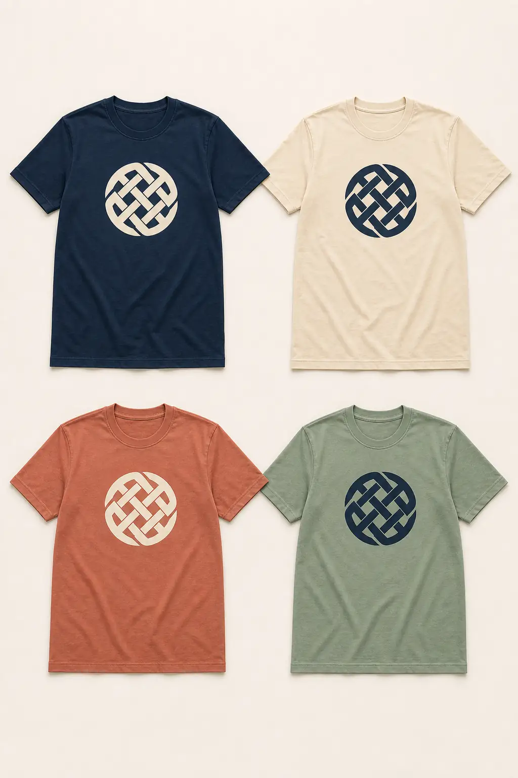
Short answer: Start with any required school, team, company, or cause colors. Then choose one garment color and a light or dark artwork version that stays readable at the intended print size and viewing distance. Review every garment color on the exact blank before approval; there is no universal shirt-and-print combination that fits every logo, fabric, method, and event.
Color choices become difficult when a group tries to choose a shirt, logo version, accent palette, and print method at the same time. Use one controlled sequence instead of asking everyone to vote on a large color catalog.
Choose colors in four steps
| Step | Decide | Approval question |
|---|---|---|
| 1 | Required brand, school, team, role, or event colors | Which colors are fixed, and which are flexible? |
| 2 | One primary garment color | Is it available in the needed garment and size range? |
| 3 | Light, dark, or full-color artwork version | Does the important mark remain clear at real print size? |
| 4 | Exact garment-and-decoration mockup | Has every produced colorway been reviewed separately? |
If an organization has formal brand rules, start there. Do not alter an official logo merely to follow a trendy shirt palette. Use an approved light, dark, or one-color logo version when available, and ask the brand owner before creating a new version.
Make contrast serve the message
Contrast is the visual separation between the garment and the artwork. A high-contrast mark is usually easier to recognize from a distance; a restrained tone-on-tone mark can look intentional when subtlety matters and the design is simple.
Start with two checks:
- Garment versus the main mark: Can the group name, role, year, or logo still be recognized at the intended distance?
- Colors inside the artwork: Do important words and shapes remain distinct after the design is reduced to its actual print size?
Use three practical starting points:
- Dark garment: begin with an approved light artwork version, then check fine lines and small reversed text.
- Light garment: begin with an approved dark artwork version, then check large ink coverage and fabric show-through.
- Mid-tone or bright garment: compare a clearly lighter and darker version at real print size; similar-value colors can merge at a distance.
Do not use color as the only way to distinguish roles or teams. Pair it with a short label, icon, number, or placement when the distinction must be understood. Adobe’s current color-accessibility guide makes the same broader point: meaning should not depend on color alone, and grayscale review can expose weak separation.
Prepare light and dark artwork versions
A single logo file is not always suitable for every shirt color. A useful apparel set often includes:
- the primary full-color logo;
- an approved light version for dark garments;
- an approved dark version for light garments; and
- a one-color version for embroidery or a deliberately simple print route.
Do not place a dark logo on a dark shirt and assume a thin outline will solve every detail. Review the complete mark at realistic size, including small type, negative space, and any internal colors.
If the only available logo is a screenshot, send it with any known color reference and explain where it came from. The logo-file guide explains when artwork should be rebuilt before production.
Keep multiple garment colors controlled
One garment color is the simplest route. Two can work when they have a clear purpose—for example, participant and volunteer roles, two school houses, or one light and one dark preference.
For each garment color:
- confirm the exact blank and available size range;
- choose the appropriate light or dark artwork version;
- check artwork contrast independently; and
- keep the same scale, placement, and hierarchy unless the mockup shows a real problem.
Do not open a group vote across every catalog color. The organizer should narrow the decision to one or two production-ready combinations and explain the constraint. The group design-agreement process keeps that review to one controlled round; a graduating class can use the whole-grade class-shirt design guide, while a large multigenerational trip can use the 50+ family vacation shirt guide to keep household or branch colors tied to a named roster.
For a fundraiser with a lead mark and sponsor grid, use the charity shirt layout guide to keep color, hierarchy, and sponsor readability in one controlled system.
Fabric and decoration change how color appears
The same digital color can look different on cotton jersey, heather fabric, polyester performance knit, and piqué polo. The physical result also depends on ink or thread, underbase, fabric dye, surface texture, lighting, and print method.
- DTF: can carry detailed multicolor artwork on light or dark garments, but the exact fabric, heat sensitivity, dye migration, dimensions, and print feel still need review.
- Screen printing: uses physical inks and separations; compare the number of colors, underbase, coverage, and setup on the same specification.
- Sublimation: works on compatible light high-polyester garments; the garment base becomes part of the visual result.
- Embroidery: uses a discrete thread palette, so gradients, tiny detail, and exact screen-color matches may need simplification.
Treat Pantone, CMYK, RGB, and hex values as references for the designer and production team, not as proof that a monitor and a finished garment will look identical.
If the decoration route is still open, use the two-question print-method guide before approving the final colorway.
Approve the actual production colorways
Before approval, confirm:
- exact garment style and catalog color name;
- artwork version for every garment color;
- front, back, or sleeve placement and real print dimensions;
- embroidery thread or print-method limitations;
- a small-size readability check; and
- one mockup per colorway included in production.
A mockup is still a digital preview, not a physical color standard. For a large order, unusual fabric, strict brand match, or uncertain combination, ask whether a physical sample or production test should be added to the schedule. The free mockup guide explains what the digital approval should contain.
How Togethread handles color planning
Share the garment, preferred base color, logo files, any official color references, the intended tone, and every planned colorway. A designer can prepare one restrained direction and show how the artwork changes between light and dark garments.
The free first-mockup timing is confirmed in writing after the coordinated-order brief is reviewed. Garment colors, artwork versions, decoration, dimensions, placements, quantity, destination, and any exceptions are confirmed in the written quote before production.
FAQ
What is the best T-shirt and print color combination? There is no universal best combination. Use required brand colors first, then choose a garment and artwork version with enough separation for the actual logo, size, method, and viewing distance. Review the exact mockup before production.
Can I order the same design in multiple garment colors? Often, when the exact garments, quantities, sizes, decoration, and colorways are compatible with the coordinated 50-piece order. Every garment color should receive its own approved light, dark, or full-color artwork version.
What if our logo colors do not look right on the shirt color we want? Use an approved light, dark, or one-color logo version when available. If none exists, ask the brand owner to approve any adjustment before production rather than changing official colors informally.
Why can a garment color look different from the website or mockup? Monitors, photography, lighting, fabric dye, heather fibers, texture, ink, thread, and underbase all affect the result. Use the mockup for composition and colorway approval, then discuss a physical reference when exact matching is critical.
Does embroidery have the same color options as printing? No. Embroidery uses an available thread palette and cannot reproduce every gradient or tiny color transition. Confirm thread selections and a simplified artwork proof for the exact placement.